
Context
Solution needed to be delivered in a few weeks for a contractual customer commitment
Tool
Claude Design
Time saved
2 days per iteration/prototype
Stakeholders
TPO, Director of Product, Engineers, Design Manager, PM
Key customer

Context
Why an AI-assisted prototype
For the discussions to be productive and for the alignment to arrive faster, we needed something that everyone can see, interact with and something that can be built fast and updated fast. Traditionally, to make a prototype of this fidelity will take at least 3-4 days to make and more days will get added to it for every iteration: for example, the Director flagged an edge case or an engineer said "we can't build that in this timeline" - we would be throwing away days of work.
So this is when I deliberately choose Claude Design, armed with Mindtickle's design system - to create an end-to-end, high fidelity clickable prototype.
Getting the most out of AI
Most users would instinctively prompt like "Add this", "Remove that", "Reduce this padding". I had done that too in early days. You do get the output and it's fast, but it doesn't really unlock what it can do for you.
I have learnt from my experience that sharing context with AI gets you better output. So, here, my first step was to share the PRD with Claude Design. Claude read the document and came back with follow-up questions. When AI understands why something is being built - users, constraints, edge cases - the quality of both the conversation and the output is elevated. The suggestions are grounded in context and the follow-up questions actually take you somewhere.
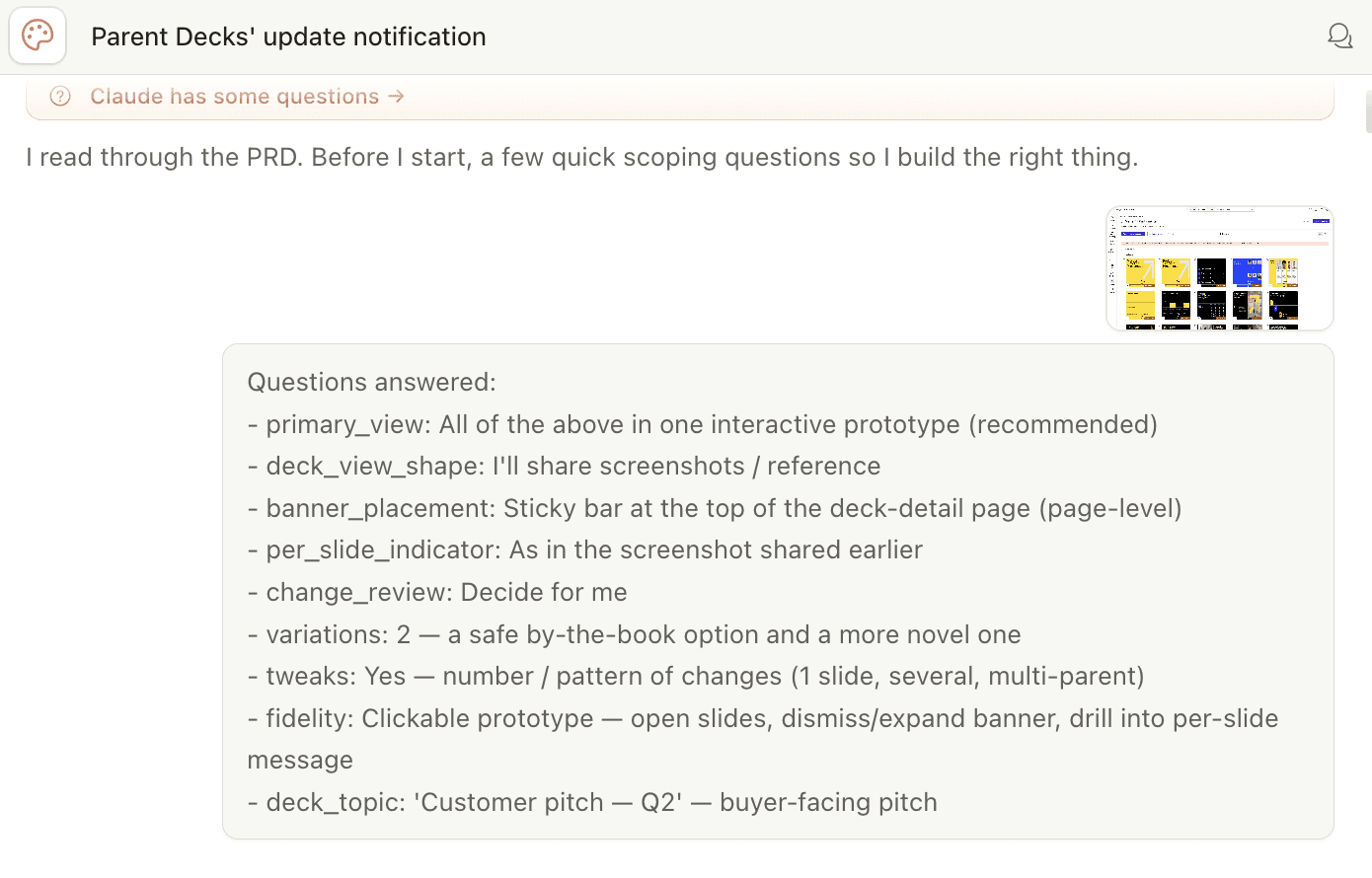
Building for new use-cases becomes easier when AI knows the context already. e.g. Midway through a session, I realised that I missed including an edge-case. Since, I had shared problem and solution vision to initially, this was very easy to add in.

One more example - at a certain point the notification banner was working well but it was taking up too much vertical space and it wouldn't have scaled properly for more data. I flagged it with a prompt "The banner is taking up a lot of vertical space. Let's put things in-line and have a max height, and a 'see more' CTA to expand" and Claude built an alternative right away.

💡
Every prompt I wrote in this session had reasoning behind it - an explanation of what I needed and why. In my experience, that's what separates a frustrating AI session from a genuinely useful one. The quality of what you get back is a direct reflection of the context you put in.
🧠
I had to know what good felt like and recognise that this wasn't it yet. Taste and judgement was mine and AI helped me fix it.
Stakeholder discussions
We convened with the full group - TPO, Director of Product, Engineers, Design Manager, PM and me - and what happened in the session proved that my call was right!
Visuals convey meaning much faster than words and I experienced that first hand.
The engineers and TPO could immediately see what needs to be built and started the much needed conversation: can we achieve the same experience with less engineering effort? What does the backend structure actually need to look like?
The Product Director could see the full solution - which meant he could flag edge cases and see how the flow fit into the bigger product picture.
And this reaction said it best:
After the internal walkthrough, I incorporated the feedback and built a final version for the customer call. In the customer walkthrough, we were able to 'show' our vision and we concluded with concrete alignment on the feature.
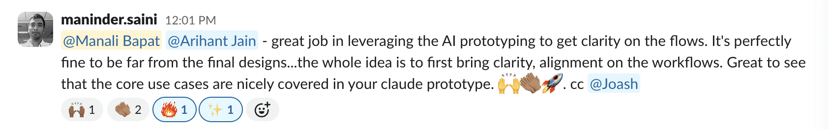
The day after the internal walkthrough, PM posted this in our team Slack:

We achieved this in 2 days - each iteration in traditional Figma prototype would have cost roughly the same. I built multiple iterations in the time it would have taken to do one in Figma.
What I took away
💡
But the process itself - what to make, when, at what fidelity, for whom, that judgment belongs to the designer.